Colouring
If you have ever compared the look of a high-budget film to a student-made one, then you’ve probably noticed a few differences.
Films made by professionals have highly skilled experts working in every area of the production process, including cinematography, production design and editing, which undoubtedly helps to influence its quality and overall look.
Another creative area which adds polish to a film is colouring.
Recommended Year levels: 7-12
Learning areas: Media, The Arts, Technologies
Requirements: This resource makes reference to different types of editing software, use whatever you or your school has access to. Small content packages of clips can be downloaded via this resource for practising with.
Considering colour
The colourist
In a professional setting, film colouring is usually completed in the final stages of the post production process, after editing has been completed. This work is undertaken by an expert colourist who uses software programs to help to balance the visuals throughout the film and sometimes add additional colour effects that add impact to the overall look and feel.
Considering colour
Even though you may not have the same level of expertise as a professional colourist, nor a huge production team or budget to work with, taking the time to consider how colour will be used in your own projects throughout all stages of the production process will enhance their quality.
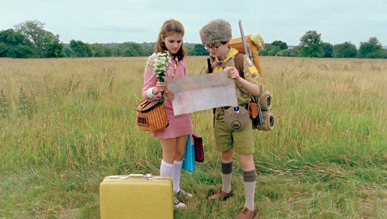
Wes Anderson is a film director who is known for his consideration and use of colour at all levels of a production. In Moonrise Kingdom (2011) careful and clever colour choices were made all the way through.
In the image below you can see how certain colours 'pop' via costumes and props, and location; but you might also get a sense that some colours and hues have been further enhanced or emphasised in the post-production process.
Colour theory presents the idea that different colours can have a psychological impact on humans.
You’ve probably noticed how your own feelings change when you’re in a room that’s painted in a calming pastel colour or when you’re dressed in something bright.
Colours also have certain symbolic connotations or deeper meanings – red can represent passion, blue can mean melancholy, green might reflect nature and yellow, joy.
Harnessing the power of particular colours will help you convey mood and meaning within your projects.
Task: Explore the Instagram account, colourpalette.cinema which showcases the use of various colour palettes in film and television productions. You should be able to preview this account even if you're not on Instagram.
Make note of any productions (films or TV shows) you recognise, or have watched.
- Select five productions, it can be a mix of ones you've seen and haven't seen - but choose ones that jump out at you for one reason or another, and have some variety genre wise.
- List the genres (they might be cross-genre or sub-genres) of each film. You might know the genre already, or you might have to look it up. Make note of any similarities/contrasts between films of the same or similar genre, and any similarities/contrasts of films from vastly different genres.
- From your list, identify any palettes you feel contain colours that are contrasting. By this we mean, keep an eye out for palettes that contain colours that present contrasting emotions, feelings, or ideas - not just a light colour and a dark colour.
The production process
Colour in pre-production
When you’re in the planning stages (pre-production) of a video project, you will make choices about the genre, time period and storyline of the production you are developing. You should also start considering the mood and atmosphere you’d like to create for the audience – perhaps through the use of a particular colour palette. Such ideas will contribute to the overall ‘style’ of your work, which can be defined as the individual and distinct qualities that you, as a unique creator, will bring to a project.
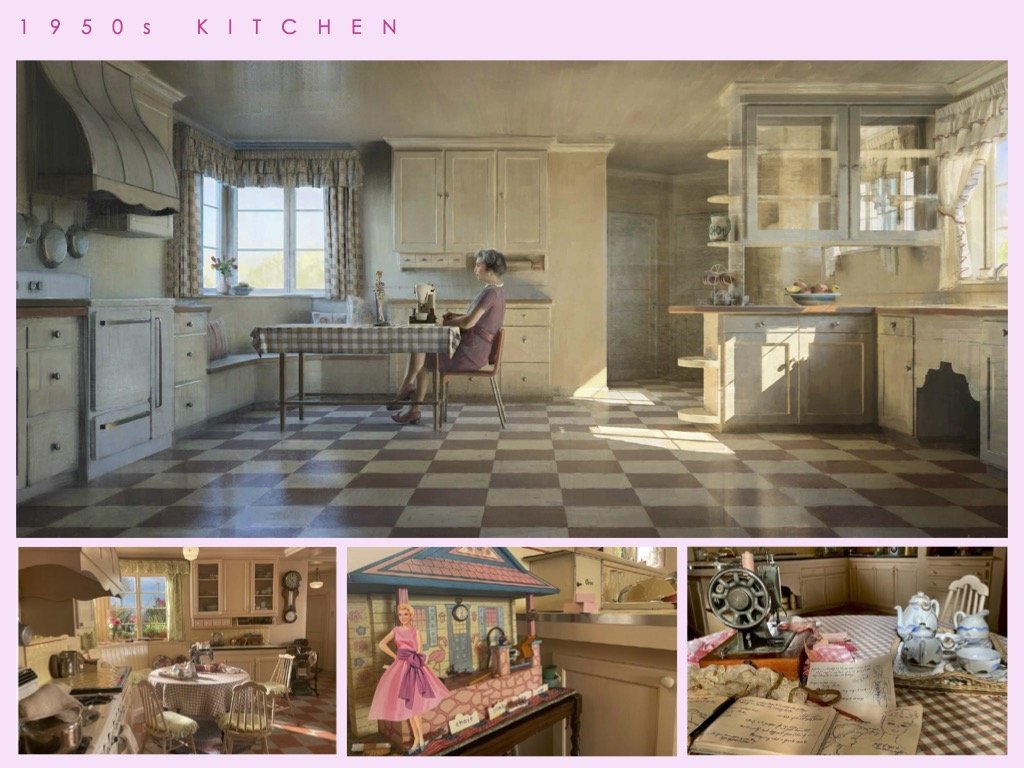
The below image is from the document: Barbie - Best Production Design Art Director's Guild website.
Production designer Sarah Greenwood’s work displays a clear colour palette in both the planning/miniature set design (top) and final set/props used (bottom) for the scenes in Ruth’s kitchen in the Barbie (2023) film.
Mood board
At this stage of the process, making a visual mood board can be a great way to collect and display sources of inspiration for your project. Along with documenting the palette of colours you’d like to use, you may also like to collect examples of locations, framing, lighting and costuming you’d like to achieve in your production.
Task: Undertake some research to explore films that share the same genre or time period as yours. Create a visual mood board to help explore what colours may be conventional (typical) for these types of films.
Colour during production
When you’re ready to shoot your footage, remember your planned colour palette and try to incorporate this in your use of setting, props and costuming.
If you’re also planning on improving or enhancing the colour of your footage in post-production, some additional tips to consider while shooting are:
- aim to capture the best quality footage you can – try to avoid a ‘fix it in post’ mentality as not everything can be fixed. Any additional post production tasks will also mean additional workload down the track
- have more light in the scene than you think is necessary. Cameras need adequate light in order to capture a high quality image and it’s much easier to take light out of a shot later rather than add it in. Use the best lights you have around. This might be professional equipment that you can borrow, or simply a few lamps from around the house, some cheap floodlights from a hardware store or even just the sun / natural light.
Colour in post-production
Once you’ve shot your footage and edited this together as best you can, it’s time to consider how colour can be applied to refine your production, further enhancing its meaning and effectiveness.
Software choices – most video editing programs will allow you to have some control over the colour of your images. Depending on availability of software and your skill level, you could choose to use the same program you’ve edited your project on or investigate a higher-end program that will give you increased creative options and control. Some options are discussed below:
iMovie offers a range of automatic colour balancing, adjustment and shot matching options that can be applied very easily at the click of a button, including a range of pre-existing filters you can use to alter the look of your clips. You can also make manual colour adjustments, using some simple sliders. iMovie is a free app for Apple product users.
Some helpful tips for how to start working with colour using iMovie can be found here.
CapCut is popular editing app for social media content creators so you may have some experience in using it already. It makes use of AI powered features, including a colourizer and custom colour palettes. These are easy to use but the program also allows for manual adjustments, should you wish to create something by yourself. CapCut can be downloaded for free online.
Some helpful tips for how to start working with colour using CapCut can be found here.
Adobe Premiere Pro, Final Cut Pro and DaVinci Resolve are three higher-end programs that are popular with professional film editors and colourists. While DaVinci Resolve is offered for free (with purchasable add-ons) online, Final Cut Pro offers a 90 day free trial to Mac users (any exported videos during this time will be watermarked) but must be purchased after that. Adobe Premiere Pro is only available to those with an Adobe Creative Cloud Membership (which many schools have, so check this before purchasing).
Some helpful tips for how to start working with colour using Final Cut Pro can be found here.
Some helpful tips for how to start working with colour using Adobe Premiere Pro can be found here.
Some helpful tips for how to start working with colour using DaVinci Resolve can be found here.
Whichever software program you choose to use, free tutorials that explore colouring specifically can be found online, either shared on the company’s website or posted on YouTube by other users. These offer a great step-by-step way to learn a new skill or achieve a particular effect and are usually easy enough for most beginners to follow.
When working with colour, be mindful that adjustments will look different depending on the screen or monitor you’re working with, so view your work in various environments if you can. It’s also a good idea not to ‘overdo’ it. Keep your colouring choices purposeful and remember what you’re aiming to achieve. A final tip when colouring is to keep an eye on skin tone if you have actors in your footage. Ensure any colour adjustments you make still allow them to look natural (and human, if that is the intention!)
Colour correction
The first step in altering the colour of your footage is to correct colour. This process focuses on making technical improvements to your footage, usually one clip at a time. Doing this helps you to even-up the look of your footage (e.g. ensure the lighting is similar in all the outdoor shots) and create a more neutral base that you can then add further creative and aesthetic adjustments to, should you wish.
When colour correcting, you will examine aspects of your images and make changes to colour and light (where necessary) by manually altering:
Colour temperature
This refers to the warmth or coolness of light in an image. It is important for filming, as along with mood, colour temperature can also help convey what time of day it might be. Each light source will have a different temperature to it. For example, fluorescent light is cooler in temperature and may look more blue or white, as opposed to candlelight which will be warmer and more yellow in its tone. You may have experienced this when purchasing lightbulbs for your home, where warm or cool versions are available. In technical terms, colour temperature is measured on the Kelvin scale.
In the following pieces of raw footage, you may notice that the colour looks a little ‘off’.
In the first clip, the image looks cool, flat and monotone. By increasing the colour temperature, warmth can be added to the footage, providing a more varied palette while still ensuring the appearance of the tree leaves and the white writing on the building look natural. You can see a corrected version here.
In the second clip, the image is overly warm so altering the colour temperature can help to cool it. You can see a corrected version here.
Activity: You can download the raw clips for the two pieces of footage that need correcting below, and have a go at adjusting the temperature yourself, using the editing software you have access to:
White balance
We’d probably say that white is a pretty easy colour to identify, right? But if you’ve ever shopped for white paint, you’ll know that there are actually a lot of versions of this shade! White can look very different depending on the lighting around it and cameras can also struggle to identify white correctly. Most cameras have an automatic white balancing setting, which means that your camera will seek out what it considers to be white in an image that you’re shooting and then adjust the way it captures all other colours accordingly. This works pretty well most of the time but can become problematic if there is no white, if you’re changing between low and high light situations or if shooting in locations with very extreme colours.
If needed, you can make some adjustments to the white balance of your images in post production. Ideally, it’s better to try and undertake manual white balancing when shooting in each location, as you can tell your camera what is ‘true’ white before you start filming so that you capture footage that is more accurate in its colour range.
Saturation
This refers to how rich or intense colours may appear. High saturation makes colours look purer and bolder. In film, creators may increase this to create imagery that feels livelier or hyper-real.
Desaturating an image can make it appear washed out or paler, which can also be useful in conveying particular meaning, such as a memory of an unhappier time.
Notice how the altered saturation levels in the following exterior and interior footage can impact the general feel of the locations shown:
Activity: Would you like to attempt to saturate, or desaturate these clips? Download all four below:
Exposure
Exposure essentially means how light or dark an image may appear.
Technically, exposure is determined by how much light reaches your camera’s sensor when filming. While filming with a little more light than necessary will help you achieve higher quality, brighter images that will be easier to adjust later, you want to ensure that you don’t overexpose (or over light) your pictures. Similarly, you don’t want to underexpose these either by not having enough light. For example, rather than shooting in the dark to achieve a ‘night time’ look, you would be better off filming with more light and then adjusting exposure and colour temperature in post production.
The following examples show how both underexposure and overexposure can impact the look and quality of footage:
After alterations to the exposure, the light is brought back into a normal range that looks right and is more appealing to the eye.
Take a look at the correction for the original underexposed clip here, and overexposed clip here.
Activity: would you like a go at fixing these clips yourself? Download the under and over exposed clips below:
Contrast
This is the difference between the light and dark areas in your images and, generally speaking, having variation in your images makes them effective. If you’re shooting in black and white, contrast will be the difference between the blacks and the whites. Are these each appearing as strong colours or is there a lot of grey? If you’re shooting in colour, low contrast will occur if there is little difference between the light and dark areas. This may make an image appear occur flat and lacking in depth. Higher contrast will provide more variation to an image – just be sure not to push it too far so as to ‘blow out’ the light and dark areas of your picture. Increasing and decreasing contrast may be purposeful to your project if it can improve your imagery or contribute to its aesthetic or symbolic value.
Highlights and shadows
The light areas of an image are called highlights and the dark areas are referred to as shadows. For a quality image that has depth and impact, you want to have both present, as this creates what is known as ‘dynamic range’. When you make manual adjustments to other aspects of an image such as exposure, you will affect the natural highlights and shadows and may need to add them back in manually.
Workflow
When colour correcting an image, think about making small, micro adjustments to one thing at a time. Keeping the image looking good to your eye - don’t overdo it or go for anything too dramatic. There’s no singular correct approach, but you may find it helpful to work in the following order:
- Undertake basic correction tasks first, adjusting contrast, saturation, then exposure.
- Use contrast to get your darks and lights as far apart as possible, while still looking good. If you’re able to view a ‘waveforms’ diagram in your editing program, aim to get the dark colours down towards the 0 value and the lights towards the 100 value but don’t go past these.
- Push your saturation as high as it will go, then bring it back until the image (and any skin tones) look enhanced but still natural.
- Explore exposure to adjust the light in the image. Make sure you don’t blow out the image’s lighter areas and accidently overexpose it.
- From here, you may like to explore white balance to further correct the whites in the image (which will impact the other colours too).
Colour grading
Once you have colour corrected your footage, you may wish to add further visual enhancements with colour grading.
Take a look at the video below, which takes a comic look at the process of colour grading and quickly shows how colour alterations can impact storytelling in film.
The below video is cleverly done to subtly introduce colour grading and its effects on genre and mood - teachers please watch first and decide if it's appropriate for your students (depiction of smoking).
Colour grading can be used to add creative consistency (e.g. warm tones to all outdoor scenes to make them appear like summer) or prepare your work for a certain setting (e.g. a cinema screen). Colour grading can also enhance your work artistically by allowing you to make aesthetic adjustments that add a particular look or feel to your project, such as a vintage or futuristic overlay, as seen in the examples below.
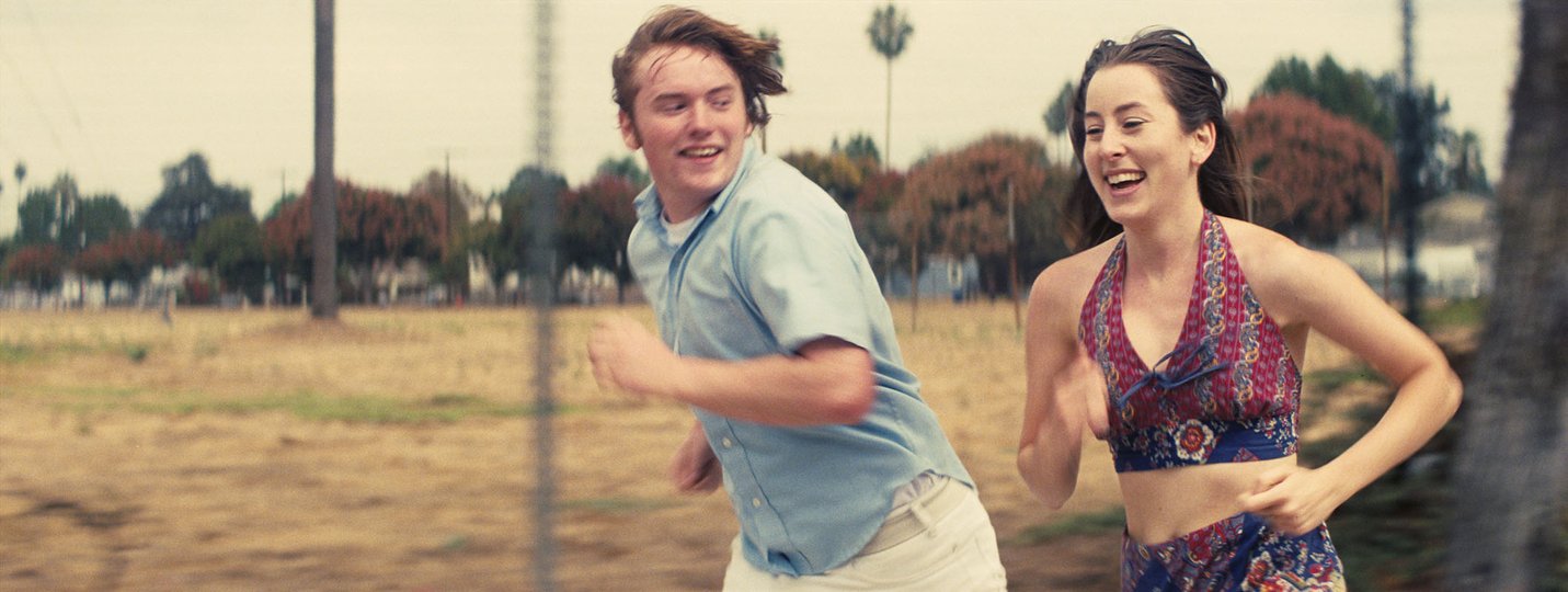
Films often use colour grading to help communicate a particular time period more authentically such as Licorice Pizza (2021) which is set during the 1970s.
When colour grading, you will go beyond just technical improvements to individual clips explored in colour correction and focus more on adjustments that may be applied to an entire scene, or even the entire project. These will predominantly focus on ideas involving:
- Hue - an actual colour
- Saturation – how intense the colour is
- Luma – how bright or dark the colour may appear
For Max Max: Fury Road (2015), colourist Eric Whipp was able to create effective night footage by adding a ‘night blue’ hue to slightly overexposed footage shot during the day, then decreasing the luma and adding shadows back in.
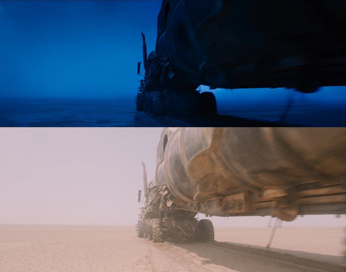
Activity: Using the 'day clip' below, see if you can do something similar to the Mad Max screenshots above using your editing software - turn day into night, and see if you can stylise the colour of the night like in Max Max (so blue, or another colour of your choosing).
Here are some helpful tutorials for the following programs:
In some software programs like iMovie and CapCut, you can do a colour grade easily by dragging a pre-existing filter directly onto your footage. In other programs, you may need to add an adjustment layer with all of your manually created colour values on top of your footage in order to apply a preferred look to all of the clips.
Professional colourists use LUTs or Look-Up Tables which allow them to create and save a colour palette template that they can then apply to specific scenes of their projects.
If you’re working in a software program like Adobe Premiere Pro, Final Cut Pro or DaVinci Resolve, you can often find free downloadable LUTs online which you can then import into your project and apply to your clips, if you wish to make the colour grading process a little easier.
Delve even further into LUTs over at Studio Binder.
We hope you got something out of this resource on colouring, be sure to check other resources as part of Film It: the filmmaker's toolkit